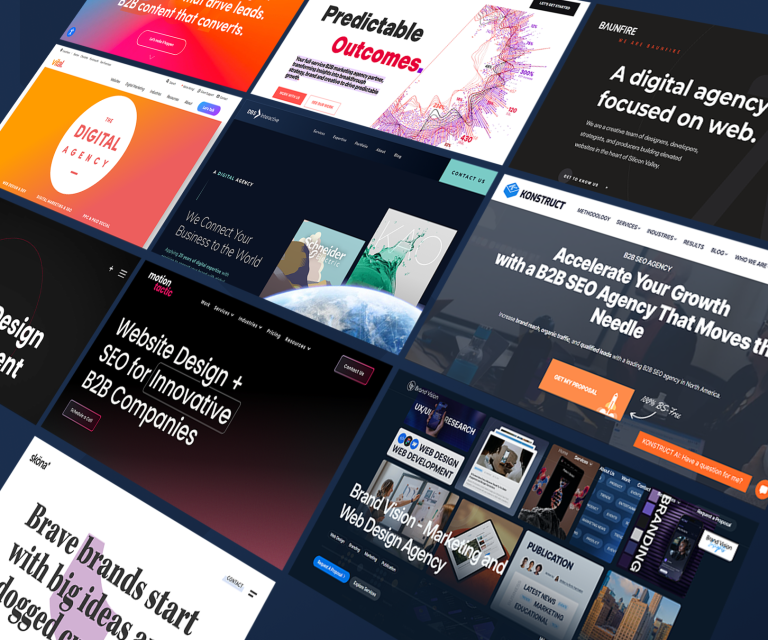
A business website is often the first place potential clients visit when evaluating a company, comparing service providers, or researching solutions to a business problem. For organizations that sell products and services to other businesses, a website must do more than present attractive visuals. It needs to communicate value clearly, establish credibility, explain services, and guide visitors toward meaningful actions. Effective B2B web design brings these elements together to create a professional digital experience that supports lead generation and business growth.
Business-to-business buyers often spend considerable time researching their options before contacting a provider. They may compare several companies, consult colleagues, review case studies, and evaluate whether a solution meets their operational requirements. A website that fails to answer their questions can lose potential opportunities before the sales team has a chance to engage. By focusing on user needs, clear messaging, usability, and conversion goals, companies can build websites that help visitors move confidently through the buying process.
Clear Value Proposition Above the Fold
The first section visitors see should explain what the business offers, who it serves, and why its services matter. A vague headline such as “Innovative Solutions for a Better Future” does not tell potential customers enough about the company’s expertise. A more specific message can immediately connect the service to a recognizable business need.
For example, a company providing cybersecurity services might explain that it helps growing businesses protect sensitive information and reduce operational risk. This communicates both the service and its potential value.
The value proposition should be supported by a concise description and a clear call to action. Depending on the business model, the next step might be requesting a consultation, booking a product demonstration, viewing a case study, or discussing a project. Visitors should not have to search through several pages to understand what the company does.
A strong value proposition also helps qualify visitors. When a website clearly explains its target industries, service scope, and areas of expertise, potential clients can determine whether the company is suitable for their needs.
User-Friendly Navigation and Site Structure
Navigation is a fundamental element of a high-performing B2B website. Visitors need to find information quickly, especially when evaluating complex services or comparing providers. Confusing menus, unclear page labels, and excessive navigation options can create unnecessary friction.
A well-organized website usually includes straightforward paths to core pages such as services, industries, case studies, company information, resources, and contact details. The exact structure should reflect the company’s offerings and the questions its target customers are likely to ask.
Navigation should follow the visitor’s needs rather than the internal structure of the organization. Customers may not understand a company’s department names or internal terminology, so menu labels should use familiar, descriptive language.
A search function may be useful for larger websites with extensive resource libraries, technical documentation, or numerous service pages. Breadcrumbs and related-content links can also help users understand where they are and discover relevant information without repeatedly returning to the homepage.
Design That Reflects the Brand
Visual design influences how visitors perceive a business. Consistent colors, typography, imagery, spacing, and graphic elements help create a recognizable identity and make the website feel cohesive.
Professional design does not necessarily mean using elaborate animations or complex visual effects. In many B2B industries, clarity and credibility are more important than decoration. A clean layout, readable text, meaningful imagery, and consistent page templates can communicate professionalism more effectively than unnecessary visual complexity.
Images should support the message rather than serve only as decoration. Real photographs of the team, workplace, products, or projects may help establish authenticity. Custom diagrams can explain complicated processes, while product screenshots can help technical buyers understand how a solution works.
The design should also reflect the expectations of the target audience. A financial services company may require a different visual approach from a creative technology agency. The objective is to present a brand that feels relevant, trustworthy, and appropriate to its market.
Strong Calls to Action
A call to action tells visitors what they can do next. Without a clear next step, even interested prospects may leave the website without engaging with the business.
Different visitors have different levels of readiness. Someone who is actively comparing providers may be ready to request a proposal, while someone researching an unfamiliar problem may prefer to read a guide or view an explanatory video. Offering appropriate options helps accommodate visitors at different stages of their decision-making process.
Primary calls to action should be visually noticeable and use specific language. “Book a Consultation,” “Request a Quote,” and “View Our Case Studies” communicate more clearly than generic labels that provide little context.
Calls to action should appear where they make sense within the content. A service page might include a consultation option after explaining the business problem and the proposed solution. A case study might invite readers to discuss a similar project. The goal is to make the next step easy without interrupting the visitor’s research.
Trust Signals and Proof of Expertise
B2B buyers often need to justify their decisions to managers, colleagues, finance teams, or other stakeholders. A website should therefore provide credible evidence that the business can deliver what it promises.
Useful trust signals include detailed case studies, client testimonials, relevant certifications, professional qualifications, industry experience, and clear information about the team. Where appropriate and authorized, client logos can provide additional context about the company’s experience.
Specific evidence is generally more persuasive than broad claims. Instead of saying that a business delivers exceptional results, a case study can describe the client’s challenge, the work completed, and the measurable outcome. Any figures presented should be accurate, verifiable, and explained in context.
Trust should be built throughout the website rather than confined to a single testimonials page. Service pages can include relevant project examples, while technical pages can explain implementation practices, support arrangements, or security measures. This gives visitors evidence at the point where they are evaluating a particular claim.
Detailed Service Pages That Answer Buyer Questions
A high-converting B2B website should explain its services in enough detail to help potential clients understand what they are buying. Short descriptions may be sufficient for simple offerings, but complex services often require more comprehensive information.
Each service page should explain the problem being addressed, the company’s approach, the intended audience, and the benefits clients can reasonably expect. It should also clarify the scope of work and identify any important requirements or limitations.
For example, a B2B web design service page might explain the discovery process, information architecture, visual design, development, content migration, testing, and post-launch support. This helps prospects understand the work involved and compare proposals more accurately.
Frequently asked questions can address common concerns about timelines, responsibilities, integrations, and ongoing maintenance. Clear information helps reduce uncertainty and makes initial sales conversations more productive.
Responsive Design Across Devices
Business buyers do not always browse websites from desktop computers. They may discover a provider through a phone, review a page on a tablet, or revisit the site from a laptop at work. The experience should remain useful across different screen sizes.
Responsive design allows page layouts, images, navigation, and content to adapt to the available screen space. On smaller devices, menus should be easy to open, buttons should be comfortable to tap, and forms should not require unnecessary zooming or horizontal scrolling.
Mobile design should prioritize important information rather than simply compressing the desktop layout. Long paragraphs can be broken into readable sections, while complex tables may need alternative presentation. Forms should request only information necessary for the intended conversion.
Testing should cover common browsers and device sizes. Teams should check not only the appearance of the website but also whether navigation, downloads, interactive elements, and conversion forms work correctly.
Search Engine Optimization and Website Performance
A visually impressive website cannot generate many opportunities if relevant buyers cannot find it. Search engine optimization should therefore be considered during the planning and design stages.
Clear page structures, descriptive titles, useful headings, meaningful internal links, and helpful content make a website easier to navigate and understand. Service pages should address the language potential customers use when searching for solutions, while educational content can answer questions that arise earlier in the buying process.
Performance is equally important. Slow-loading pages can frustrate visitors and interrupt their research. Optimized images, efficient code, suitable hosting, and limited unnecessary scripts can help improve loading speed.
Website teams should monitor performance and technical issues after launch. Broken links, outdated content, mobile usability problems, and indexing errors can reduce the value of the site over time. SEO should be treated as an ongoing activity rather than a final checklist item.
Lead Capture and Conversion Forms
B2B websites often rely on forms to generate inquiries, consultation requests, and product demonstrations. Form design can influence whether interested visitors complete the process.
A form should request information that supports the next step without creating unnecessary effort. A simple consultation request may need only a name, business email, company, and brief description of the requirement. More detailed qualification questions may be appropriate when the service requires substantial preparation.
Explain what happens after submission. Visitors may want to know whether a team member will contact them, how their information will be used, or whether they will receive a confirmation email. Clear expectations can reduce uncertainty.
Forms should be tested for usability, validation errors, mobile compatibility, and successful delivery to the appropriate team. Analytics can help identify where users abandon the form and whether improvements increase completed inquiries.
Conclusion
A high-converting B2B website combines clear messaging, intuitive navigation, professional branding, credible proof, responsive layouts, useful service information, strong calls to action, and reliable technical performance. Each element supports the same objective: helping the right buyer understand the business and take an appropriate next step.
Companies planning a redesign should begin by understanding their audience, business goals, and current website challenges. They can then prioritize improvements based on customer needs and measurable outcomes. With a thoughtful strategy, B2B web design can become a practical business asset that supports trust, lead generation, and long-term growth.